Create Trellis Chart in Tableau for Data Visualization
Create a Trellis Chart in tableau using simple calculations to show a nice high-level view. Trellis charts are a version of a small multiples chart that organizes the dimensions in the view across a grid.

Step1:
First, create X and Y calculation fields for the number of splits we need in our visualization.
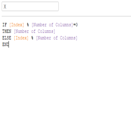
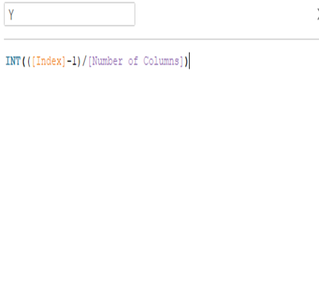
Create a calculated field for the index and convert it to discrete.

The Number of Columns is the parameter where we can set the number of splits per column.

Step2:
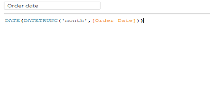
After creating the X and Y fields drag them to the columns and rows shelf and create a date calculated field as shown below.
Step3:
Now drag the date calculated field to the columns shelf and change to the continuous field. Similarly, drag sales field to rows shelf as a continuous field and sub-category to colour/details in marks card.
After that edit table calculation for X and Y fields by changing compute using to specific dimensions to sub-category and order date.

Now we have got the visualization is done. Let do some more calculations to show the sub-category names in each box.
Step4:
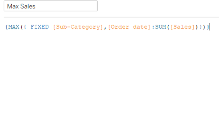
Create Max Sales calculation as shown below.
Then create a Mid-Point calculation as shown below.
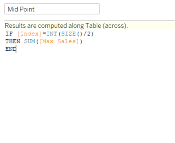
Now drag Mid-Point to rows shelf and edit table calculation and set compute using to order date and add a sub-category to labels in marks card.
Step5:
Finally dual-axis and remove the headers of X and Y fields and do the necessary format things.

Follow us for more such topics and suggestions.Also, click the link below to follow us in LinkedIn https://www.linkedin.com/showcase/sphyzee-analytics/about/
